


Select a language
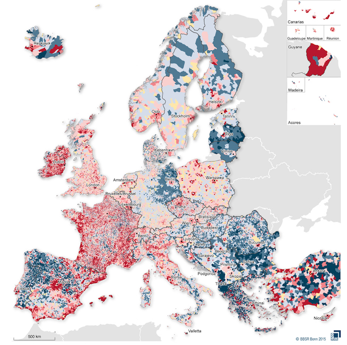
This map shows the average annual change in the population of 43 European municipalities. Blue indicates that the population has fallen, red that it has risen. The intensity of the color is proportional to the intensity of the demographic change: it is more intense where the change has been superior to 2 per cent per year.
The data refer to 2001-2011 and are the most recent available. They were gathered and elaborated by researchers at the BBSR (Bundesinstitut für Bau-, Stadt- und Raumforschung), the German public organisation for land and geographic studies.
The European regions with the largest population growth are the British isles, France and Mediterranean Spain. Those where the population has decreased the most are the Balkans, the north-western Iberian peninsula and most of the countries around the Baltic sea. Trends can vary within the same country: for example, population grew fast in most of the main north-western European cities.
Do you like our work?
Help multilingual European journalism to thrive, without ads or paywalls. Your one-off or regular support will keep our newsroom independent. Thank you!